Loading


After providing some initial designs we set about nailing down the design and with help of Jon at Lumenautica we were able to produce a stylish clean look which completely redefined the Lumenautica brand.
The first element we worked on was the home page which includes some really cool features like animating image galleries and slideshows to view Lumenautica's amazing work. While the website is fully editable via the CMS, it’s also fully responsive which enables the site to look amazing on all devices.
The end result is a beautiful website which really put’s Lumenautica ahead of the curve. The layout, the styling, the images and the typography have combined to reflect a professional, dynamic company with a rich history of providing high quality global yacht sign excellence.
“Right from the initial concept, I could see that their designer, Adam, had our exact vision and aesthetic in mind. I chose eSterling on that reason alone and I couldn’t be happier with the outcome. I wouldn’t hesitate in recommending them to any business associates, family or friends.”
JOHN FREEMAN – DIRECTOR
A multi page brochure website which features image galleries, Google Translate, animating slideshow, embedded YouTube video, interactive portfolio, a blog and is fully responsive.


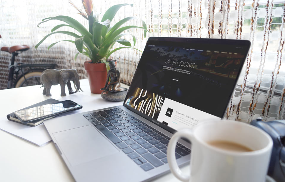
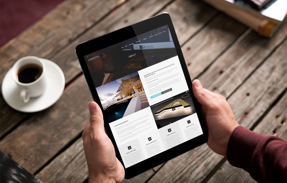
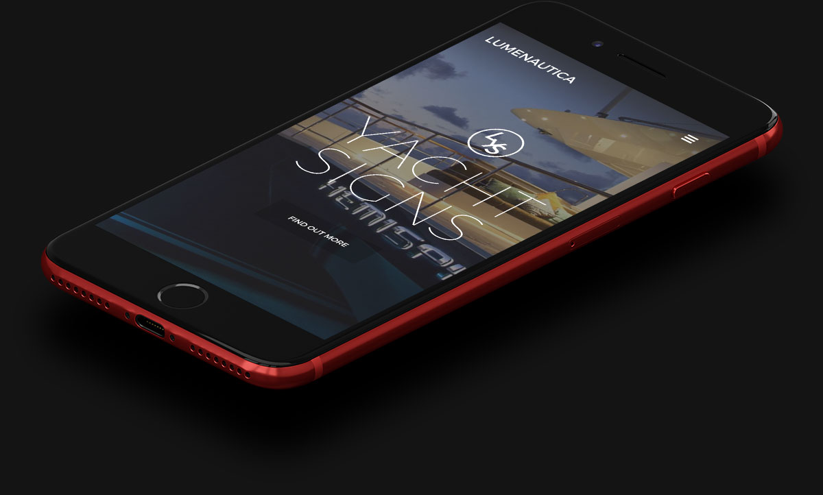
As with all our websites, the Lumenautica website looks great on all devices. The mobile view is tailored to the behaviours of the 30%+ of traffic which visit the site on a mobile device.
Our websites are thoroughly tested prior to launch so all new visitors experience a stunning, easy to use website no matter the device thy use.
