Loading


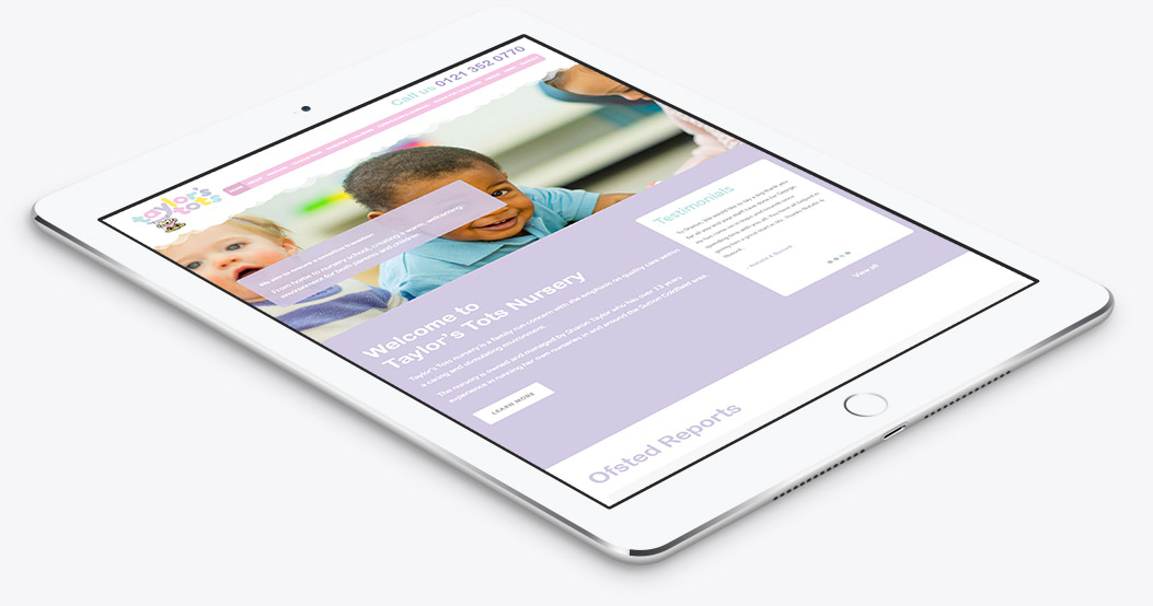
eSterling were approached to design and build the new Taylor’s Tots website which needed the same care and attention that Taylor’s Tots provide their children. The brand was already in place and the most important part of the design process was portraying a fun and happy environment for children which is important to the Taylor’s Tots brand.
Not only that but the design needed to convey a stimulating and caring philosophy too which meant our designers really had to pull out all the stops!
Our Designer Kieran explains it better:
“I wanted a website which would really stand above other nursery websites on the web and I feel eSterling delivered!”
SHARON TAYLOR – OWNER
The aim was to produce a high-end website which would give Taylors Tots a more professional online image which has been achived and then some! The beautiful bespoke design really talks to the parents and children alike. The content rich website really offers a lot of detail and theres nothing more parents like is detail when it comes to their children.


We feel we have gone above and beyond with this website as the feedback from the staff and parents has been encouraging. With traffic up by 30% the website really has exceeded expectation. We look forward to helping Taylor's Tots grow in the future and help many more children.
If you’re interested in seeing if we can take your website to the next level simply get in touch.
